A practical link-page plan for a veterinary practice
An owner must quickly distinguish routine care from emergency help. Plan the buttons, destination checks and handover for clinic entrance sign.
By ShortFreeURL Team · 11 September 2026
Start with the visitor’s question
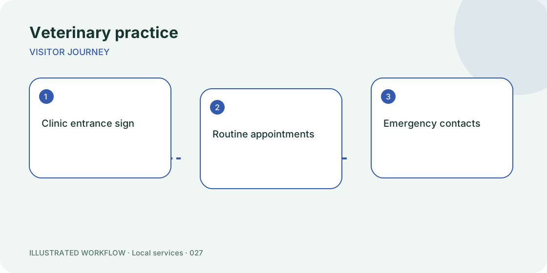
An owner must quickly distinguish routine care from emergency help. That is the job of this page. A visitor arriving from clinic entrance sign has less context than someone already browsing the full website. The first screen should answer the immediate question, then offer a small number of relevant next steps.
For this veterinary practice example, lead with “Routine appointments”. Place “Emergency contacts” next, and keep “Opening hours” and “Travel directions” available below. This order is a starting hypothesis, not a promise that the same arrangement will work for every business.
Build a page that can be maintained
Open Pages, choose the veterinary practice template and replace the example destinations before publishing. Set a recognisable title and a description that explains the service. Use a text block for context that must be read before a click; use a contact block for a working email, telephone or contact-page address.
Keep the public page in draft while reviewing it. Open each destination directly and check that the visible button label describes what actually happens. “Routine appointments” should not unexpectedly lead to an unrelated sign-up form. If the destination requires an account, say that beside the action.
Check the real placement
Test the page on a phone from the actual clinic entrance sign, not only from the editor preview. For a printed placement, print a proof at the intended size and scan it under normal lighting. Keep a readable address near the code as an alternative way to reach the page.
A specific risk in this workflow is: never hide the emergency number behind several menus. Assign someone to recheck that detail when the underlying information changes. A stable public page address is useful only if someone maintains the information behind it.
Decide what success means
Audit emergency-contact visibility rather than optimising only clicks. Record the time period and placement alongside the number. A button tap is evidence of interest; it is not proof that an external booking, payment or application completed. Confirm the final outcome in the system that receives it.
At the next review, change one important element, such as the first button or its wording, and record the date. Avoid replacing every destination and every headline at once: it becomes difficult to understand which change affected behaviour.
Handover checklist
Keep the page address, destination list, owner and next review date together. Ask a colleague to use the page without instructions. If they cannot find “Routine appointments”, simplify the first screen before promoting it.
Browse page templates or read the setup guide for this workflow.